Color isn’t decoration. It’s impact.

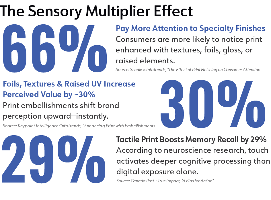
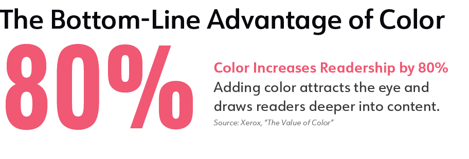
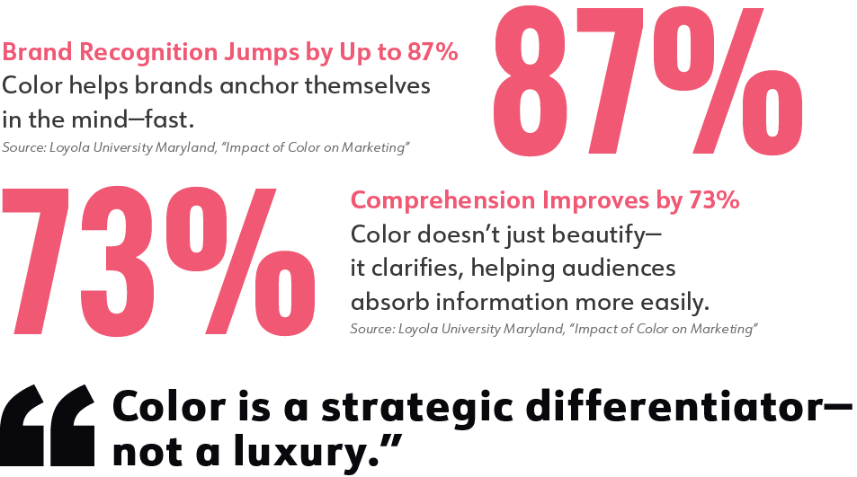
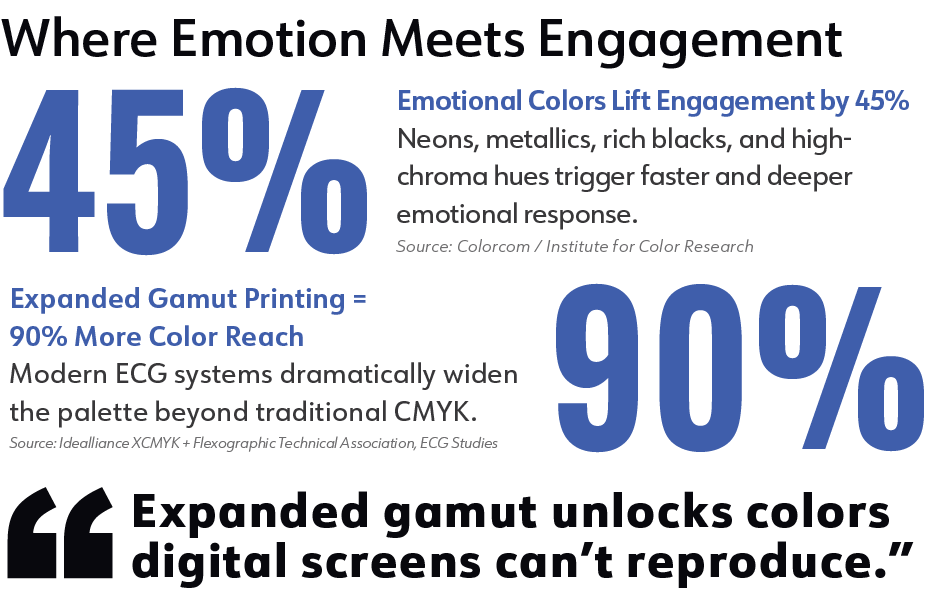
In an era of digital sameness, color, texture, and tactile finishes are redefining what print can make people feel, remember, and act on.

The Bottom-Line Advantage of Color

Color Increases Readership by 80% -  Adding color attracts the eye and draws readers deeper into content. (Source: Xerox, “The Value of Color”)
Where Emotion Meets Engagement

Emotional Colors Lift Engagement by 45% - Neons, metallics, rich blacks, and high-chroma hues trigger faster and deeper emotional response. (Source: Colorcom / Institute for Color Research)
Expanded Gamut Printing = 90% More Color Reach - Modern ECG systems dramatically widen the palette beyond traditional CMYK. (Source: Idealliance XCMYK + Flexographic Technical Association, ECG Studies)
The Sensory Multiplier Effect

66% Pay More Attention to Specialty Finishes - Consumers are more likely to notice print enhanced with textures, foils, gloss, or raised elements. (Source: Scodix & InfoTrends, “The Effect of Print Finishing on Consumer Attention”)
Foils, Textures & Raised UV Increase Perceived Value by ~30% - Print embellishments shift brand perception upward—instantly. (Source: Keypoint Intelligence/InfoTrends, “Enhancing Print with Embellishments”)
Tactile Print Boosts Memory Recall by 29% - According to neuroscience research, touch activates deeper cognitive processing than digital exposure alone. (Source: Canada Post + True Impact, “A Bias for Action”)

From issue

Winter 2025